Knowledge Portal Redesign
Empowering minds, unleashing potential
Transforming a content-heavy knowledge base into an intuitive, high-performing support experience.

CLIENT
Vindicia
TYPE
Knowledge Portal Redesign
SERVICES
UX/UI Design
01
Challenge
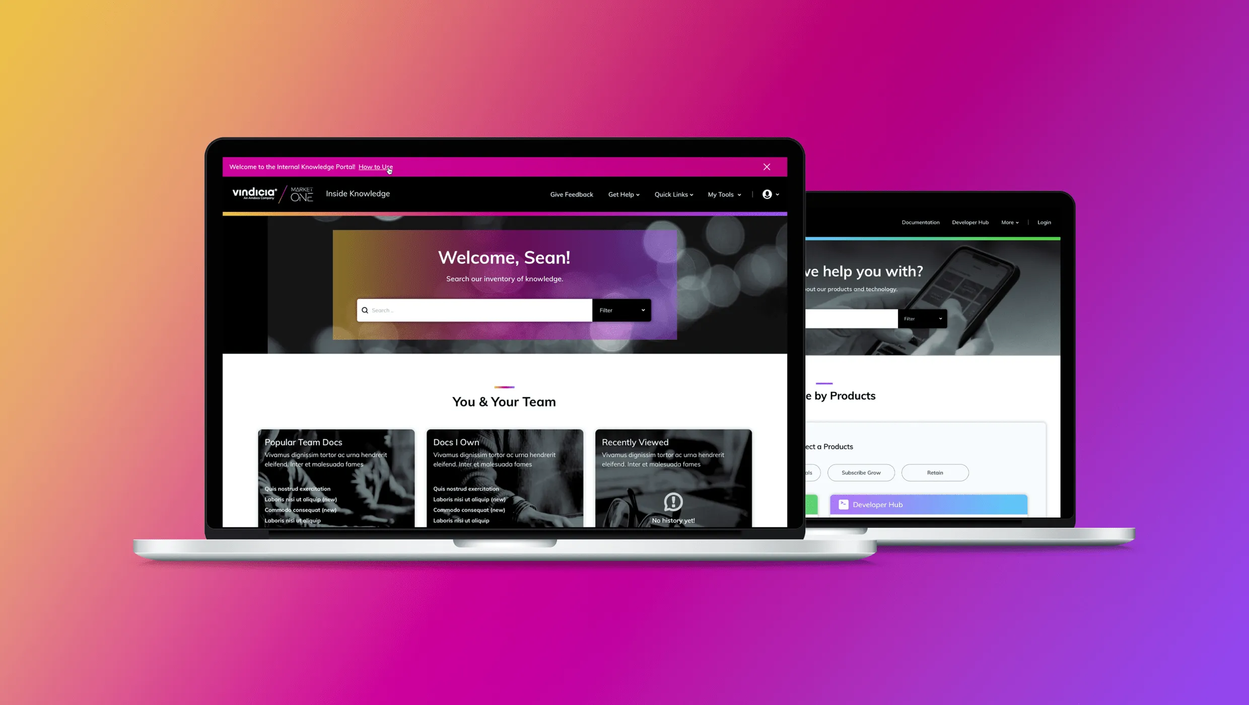
Vindicia, a leading provider of subscription billing solutions, recognized the need to enhance their online knowledge portal to better serve their customers and employees. Selecting Zoomin as the platform provider was a step towards this goal, but they required expertise to elevate the portal’s information architecture and overall user experience. Common feedback from users highlighted challenges with ease of navigation, content relevance, and search functionality, indicating an opportunity to improve user satisfaction and efficiency in accessing information.
02
Solution
In response to this need, Vindicia engaged VSURY to address the feedback from knowledge portal users and ensure successful adoption of their new platform. VSURY collaborated with internal stakeholders to understand the inventory of available content and developed multiple tailored navigation schemas. Working in partnership with Zoomin, a customized user interface was developed to seamlessly integrate with Zoomin’s platform, optimizing the portal’s user experience.
The collaborative efforts between Vindicia, Zoomin, and VSURY yielded significant improvements in the knowledge portal’s performance. The refined navigation schemas and design styles enhanced usability and accessibility, leading to increased user engagement and satisfaction. Users reported greater ease in finding relevant information, contributing to heightened productivity and a more positive overall user experience.
Caption
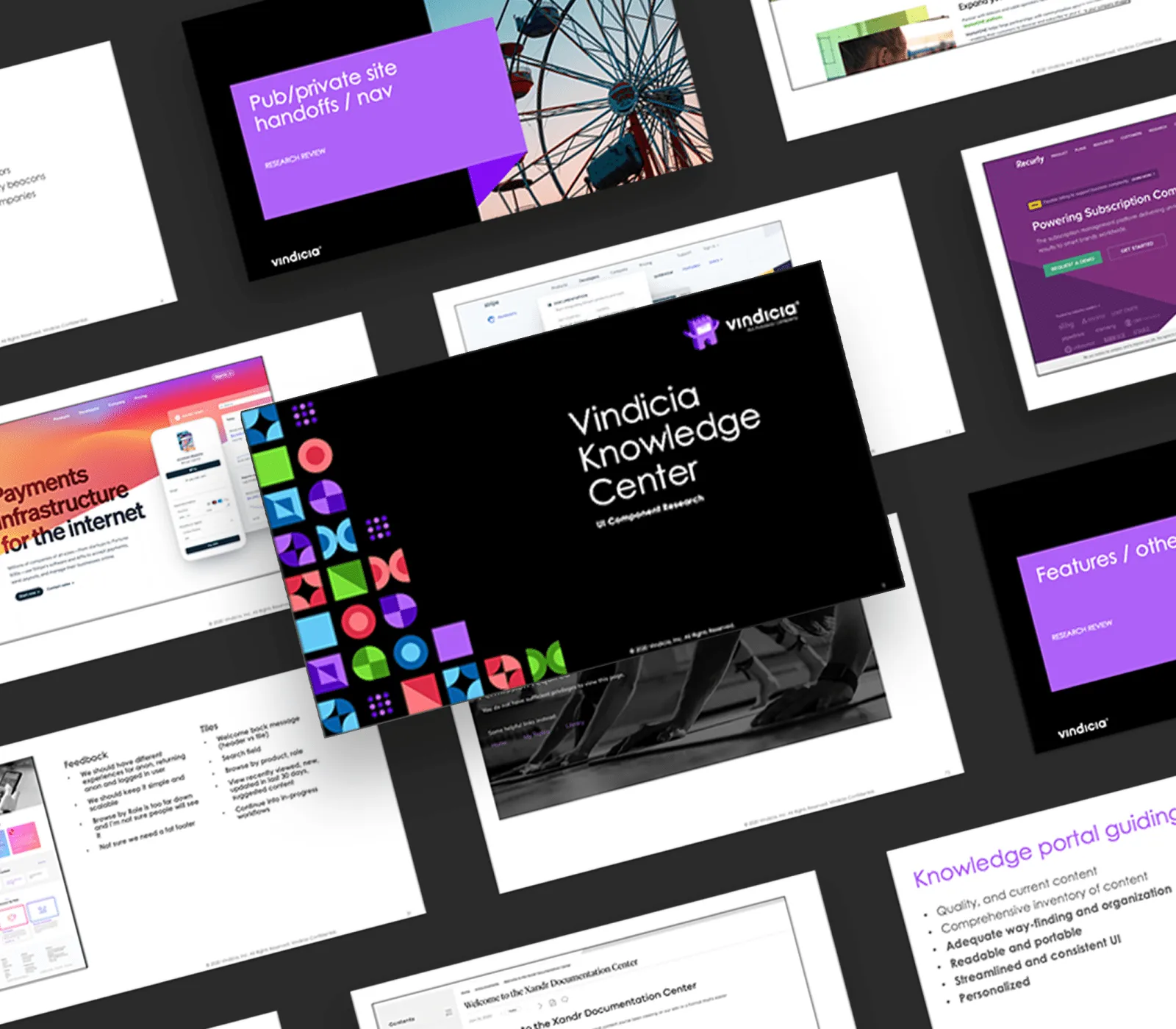
Insight Brief Based on Category, Competitor, and Best Practice Research
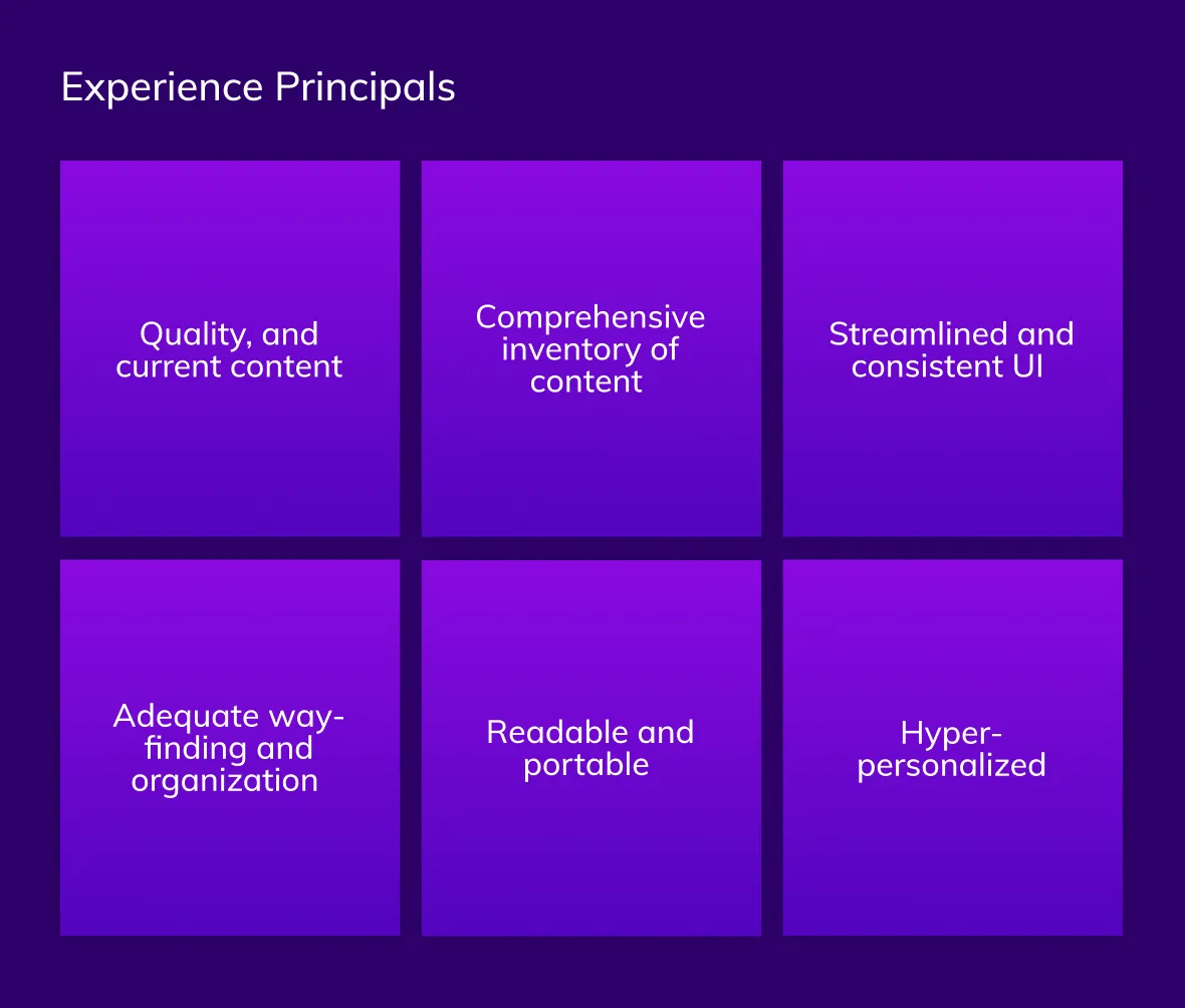
Experience Design Principles
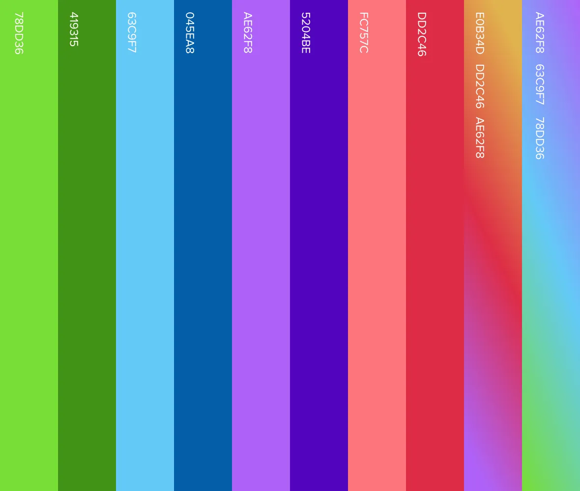
Color Palette
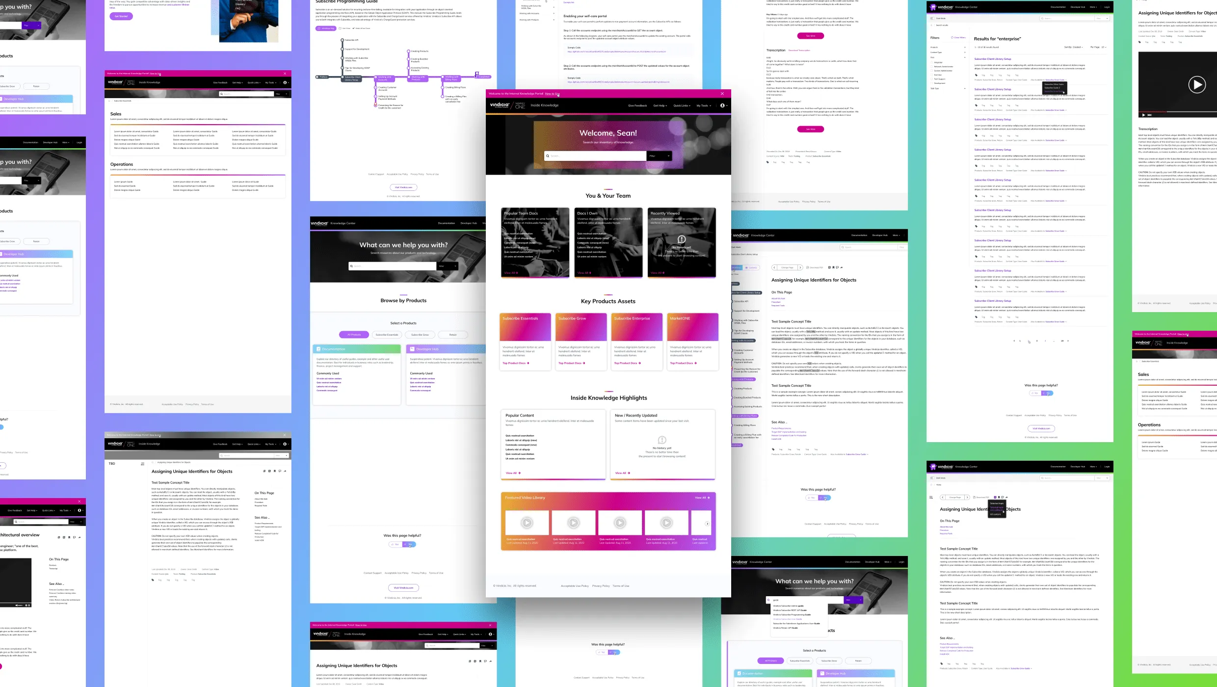
Site UI Design Templates
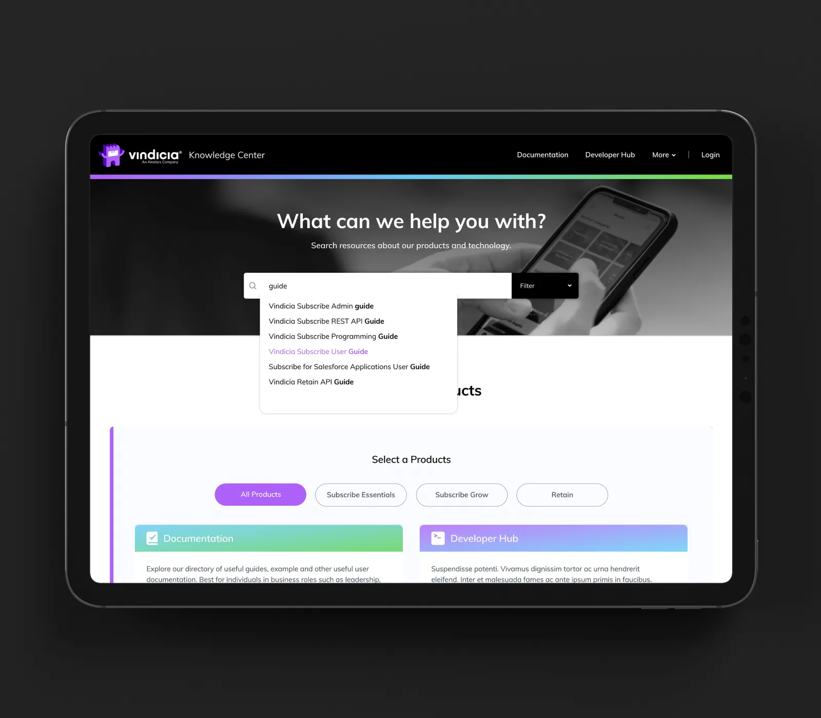
Advanced Content Browse Experience
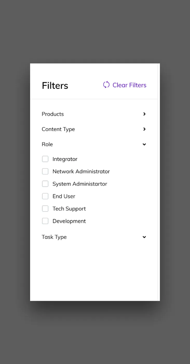
Advanced Filtering
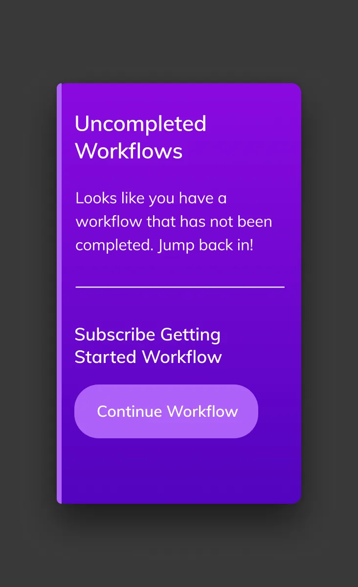
Workflows
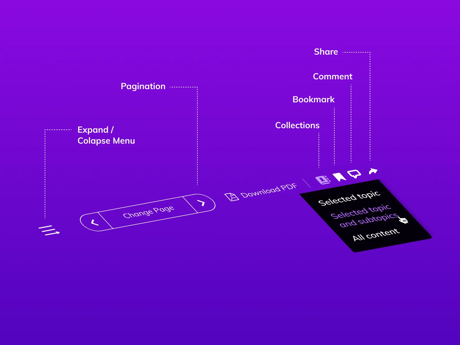
Advanced Content
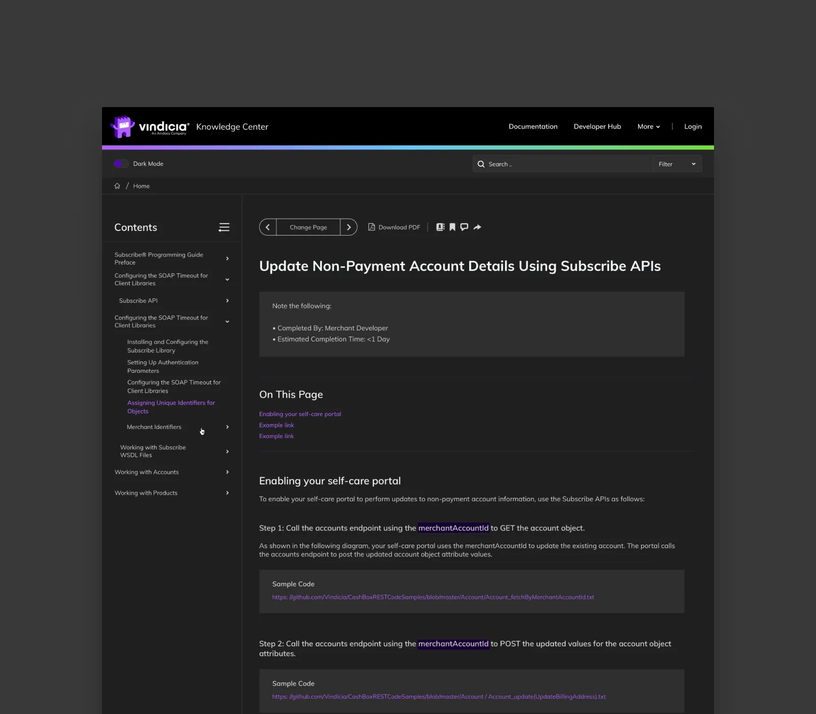
Dark Mode UI
Next
website redesign
Leading with AI. Cutting through the noise.
A complex platform, reimagined into a digital experience that delivers clarity, confidence, and results.

